Kansas City Monarchs
Brand Identity Concept
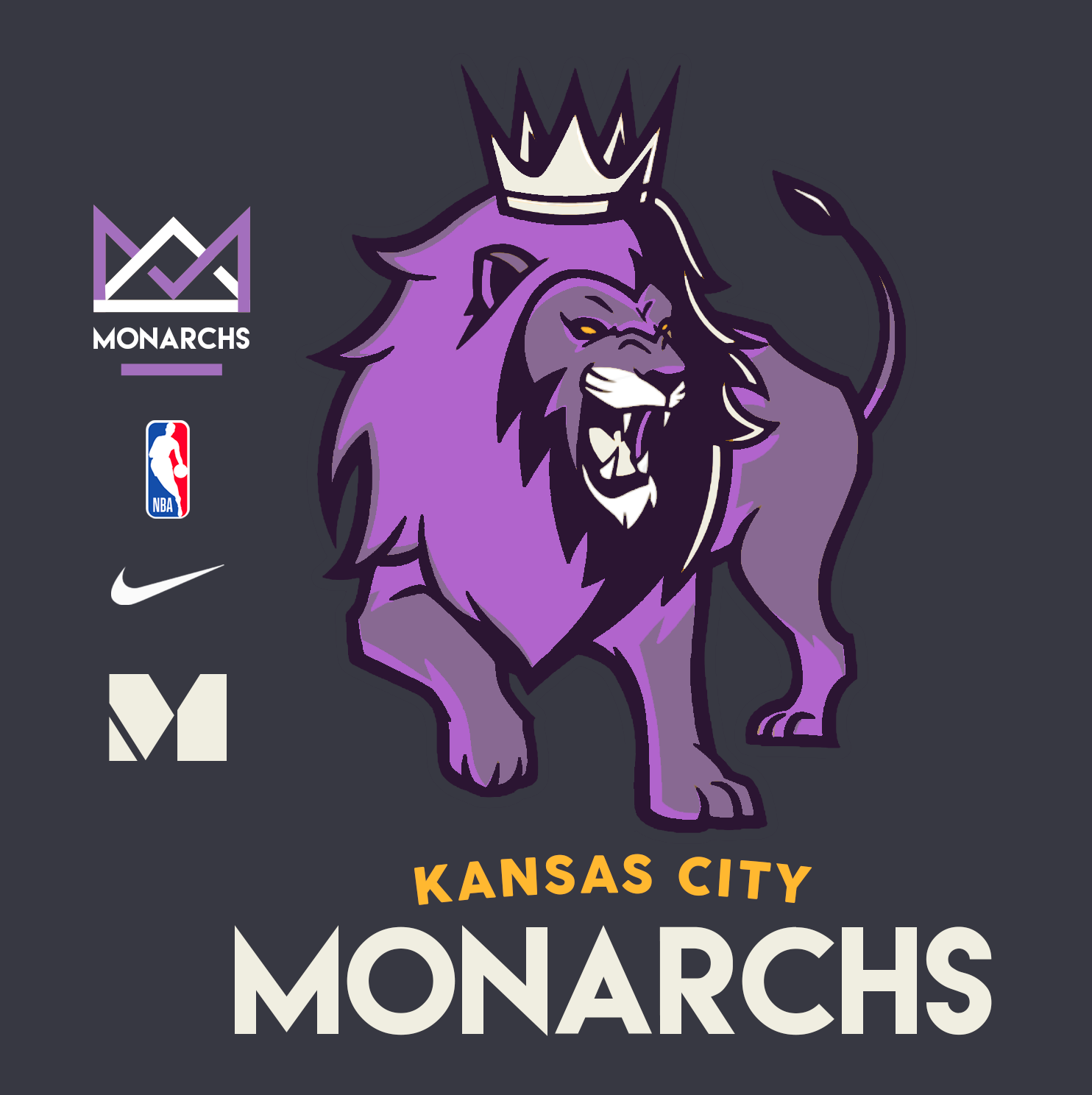
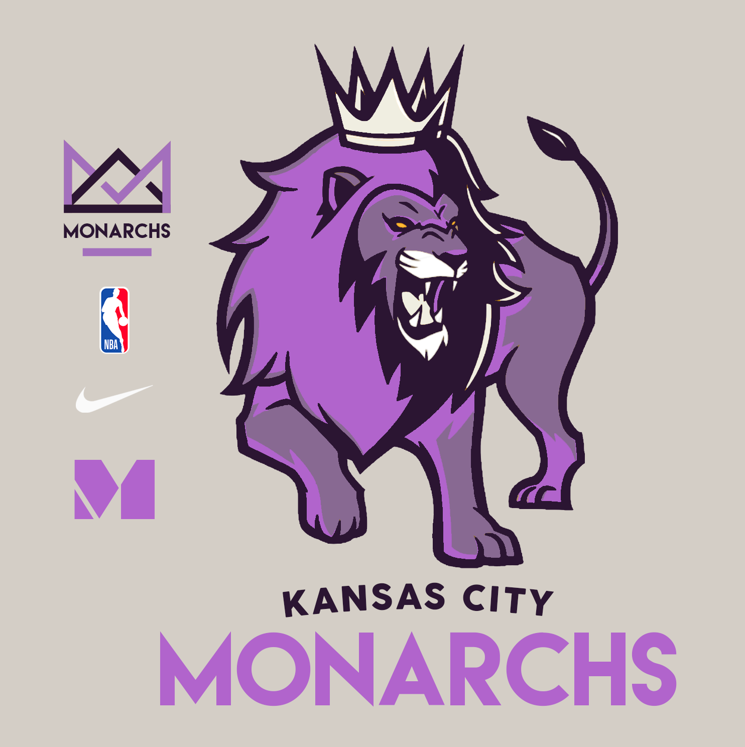
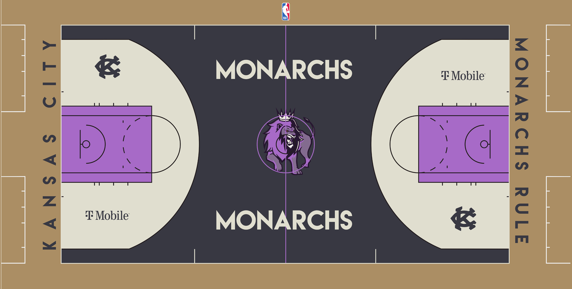
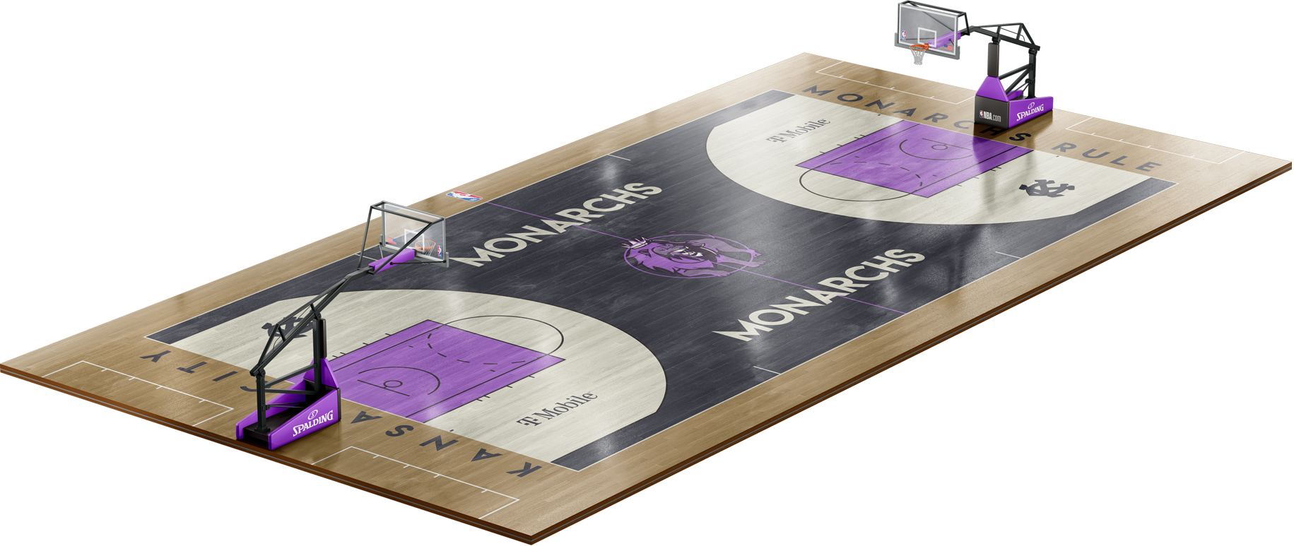
I wanted to reimagine what an NBA team could look like if the league expanded and granted Kansas City a franchise. The legacy and linage of strong proud team names like the Chiefs and Royals all hinge on pride and royalty. Staying within that naming convention I explored what the Kansas City Monarchs might look like as our new NBA team.
Using the Monarchs name draws on the rich history of the Negro Leagues while seeing what the brand could evolve into using a modern contemporary approach.
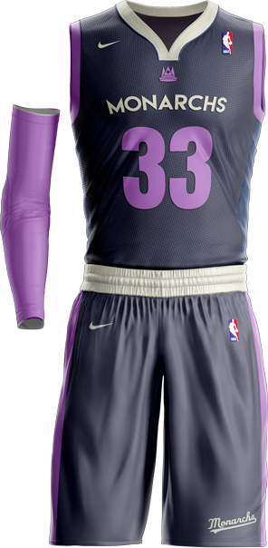
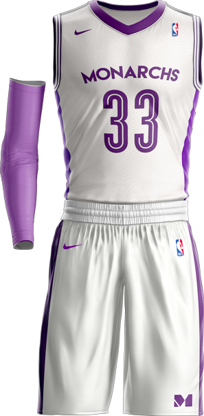
Purple was chosen as the main team color because it represents royalty and combines the colors of our other two local teams. Chiefs (Red) + Royals (Blue) = Monarchs (Purple.) I used yellow as an accent color to help stand apart from other teams. While studying the league color chart purple was a very underused color compare to most which was another reason why I chose to explore this path.
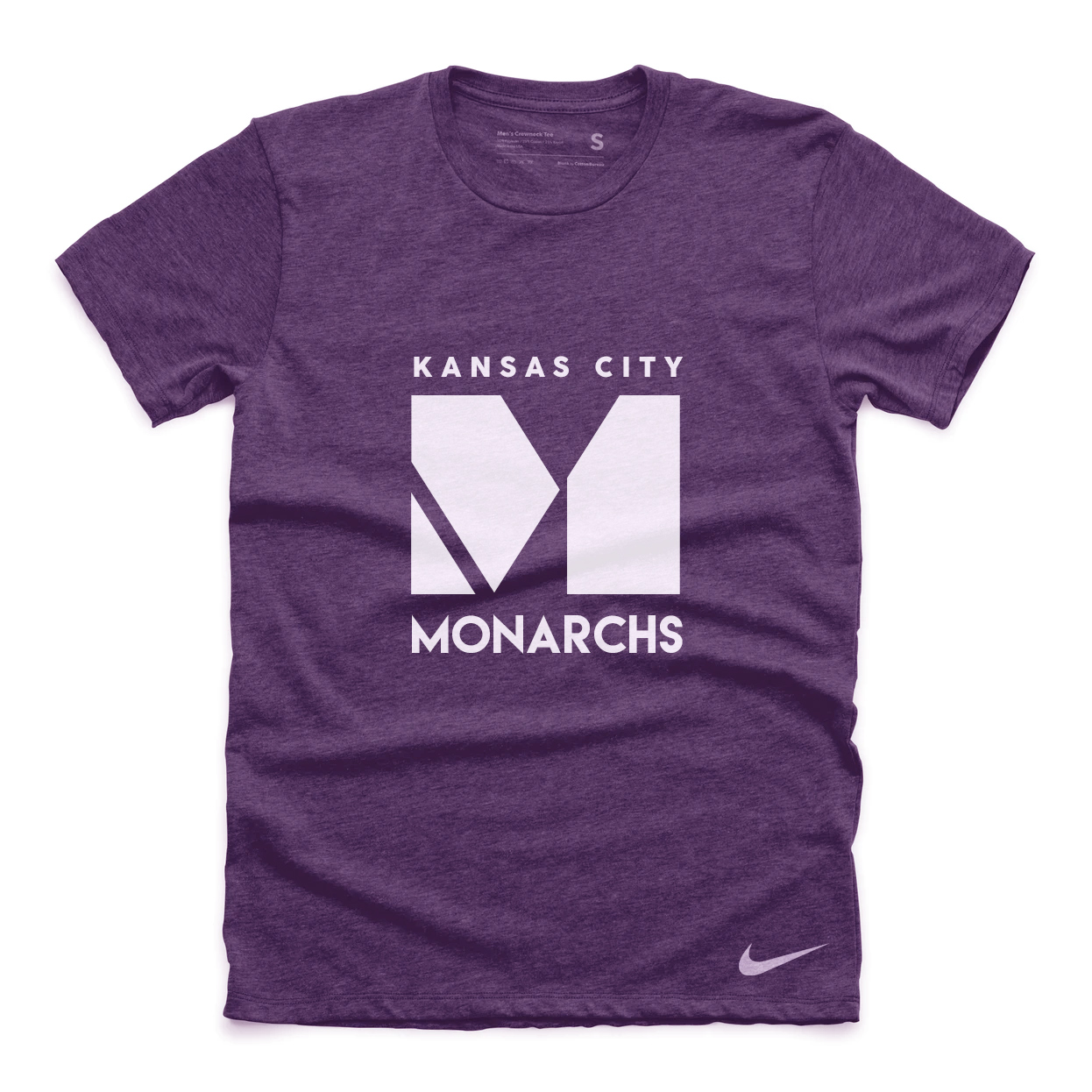
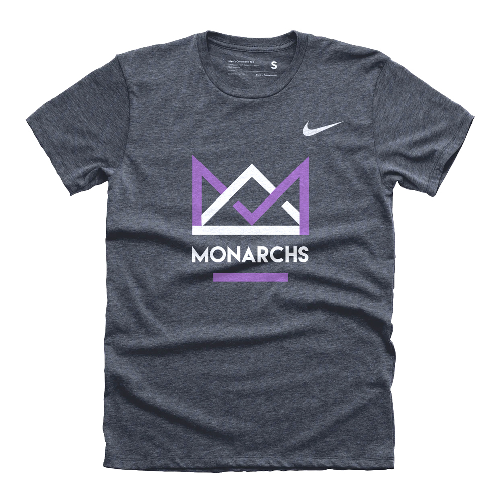
By creating a unique "M" insignia it allows for a secondary word mark along with our geometric crown that also features an "M" hidden in the design.

Jersey Designs
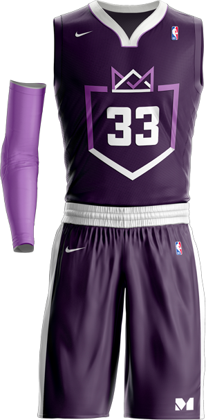


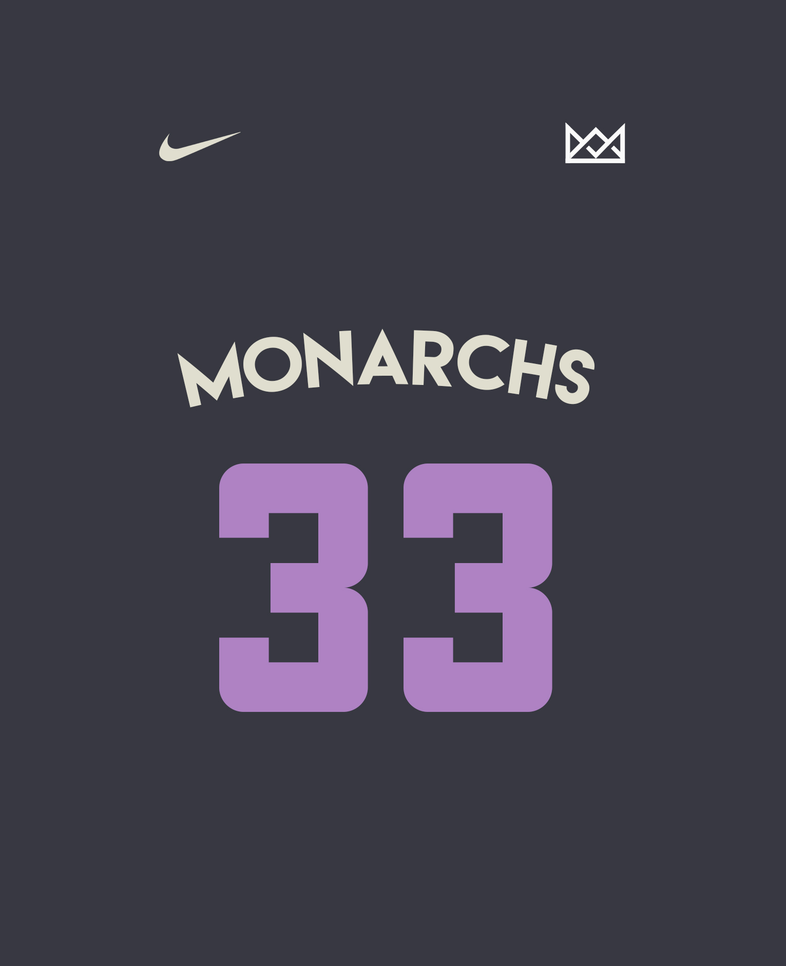
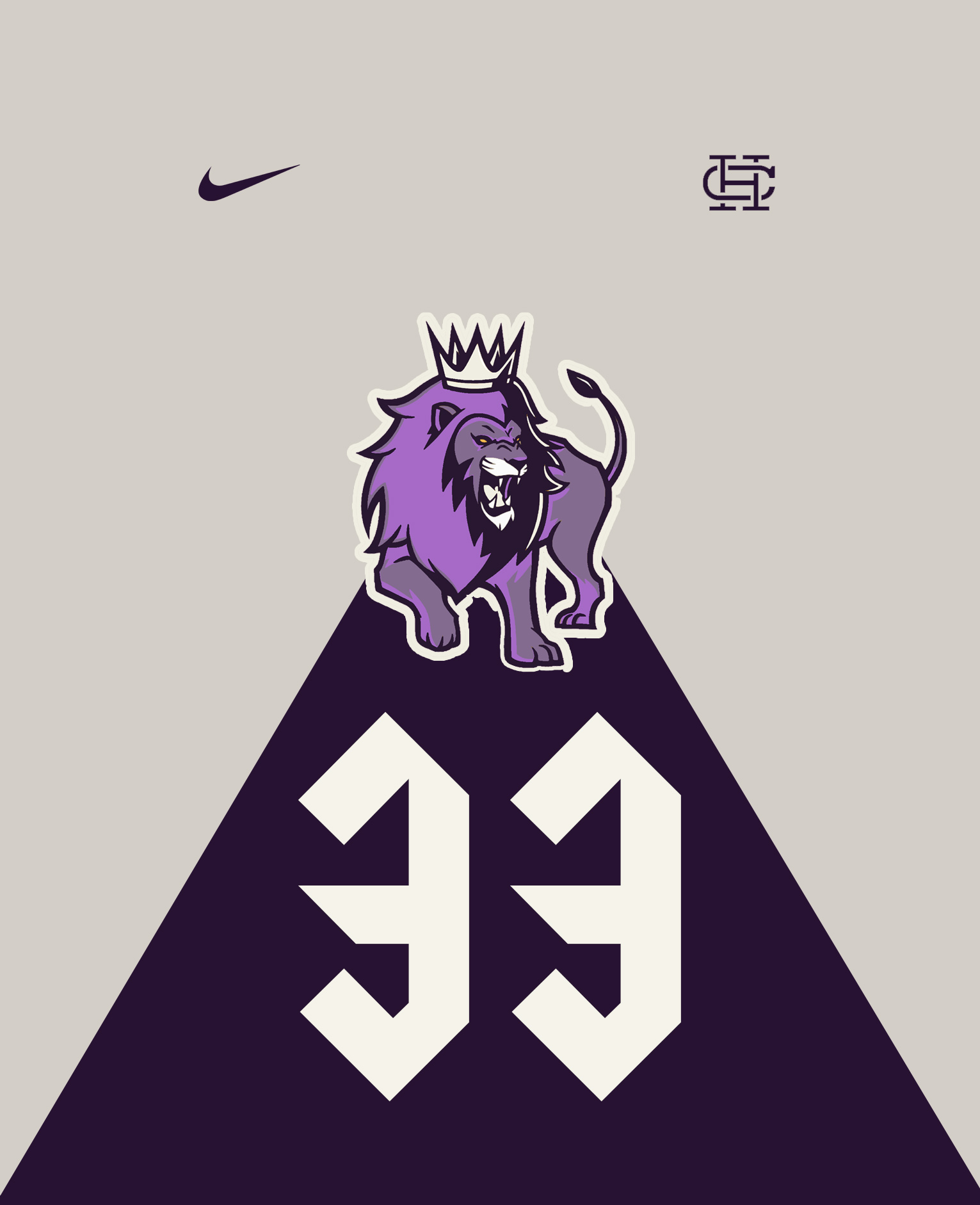
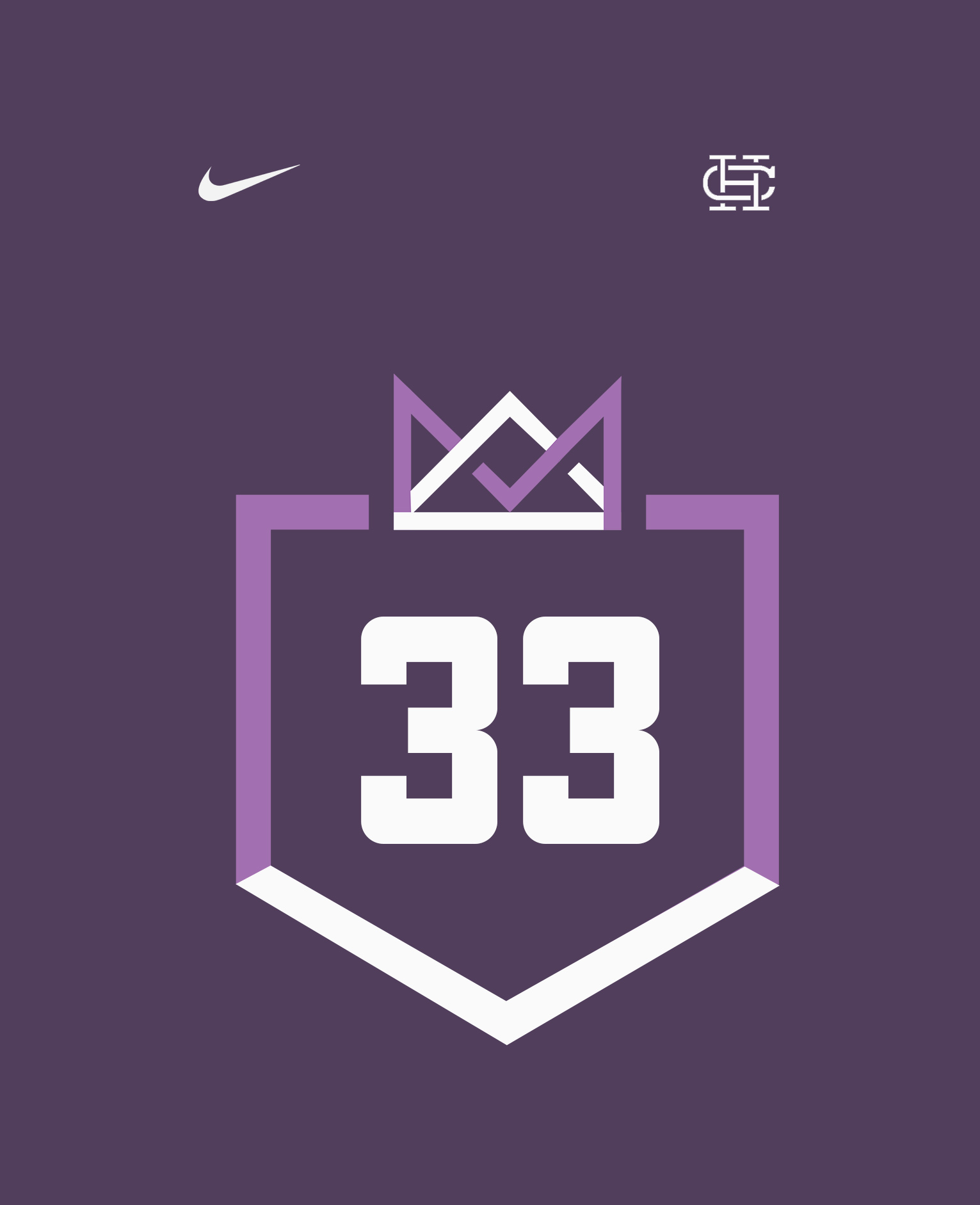
The Royal Court Design
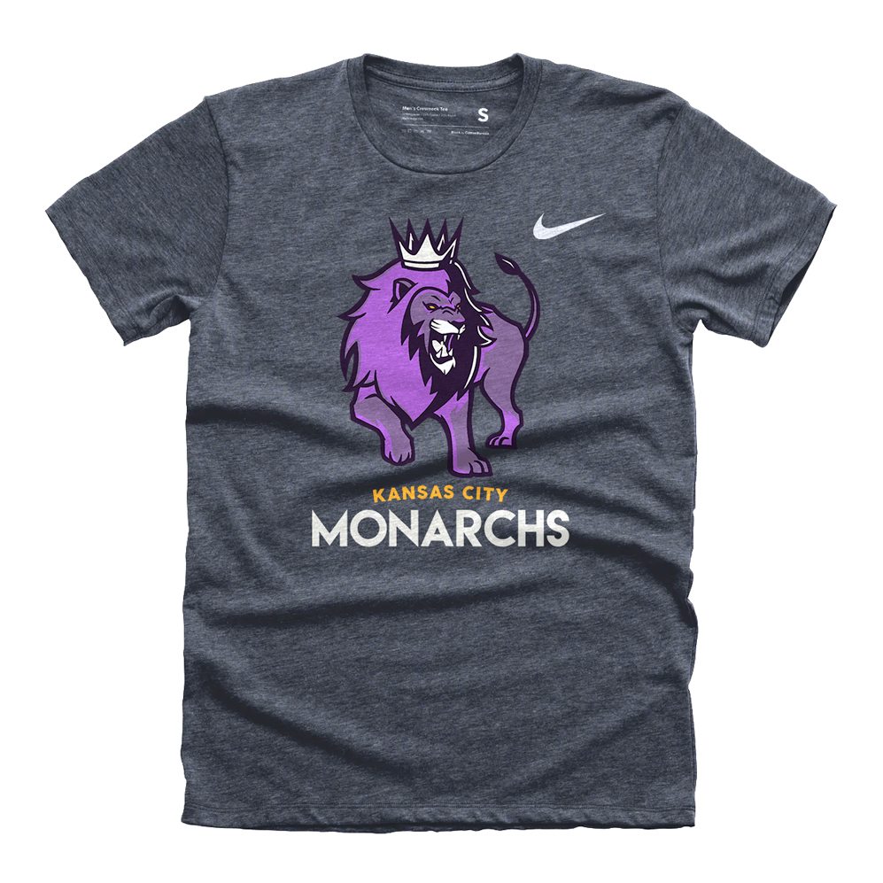
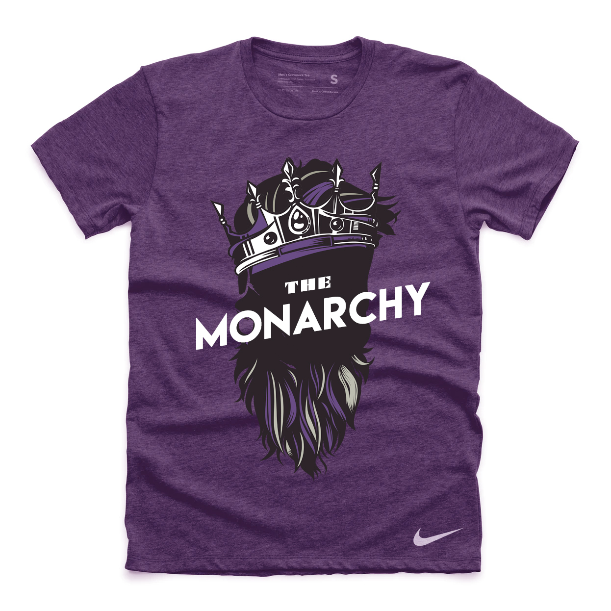
Monarch Merch
