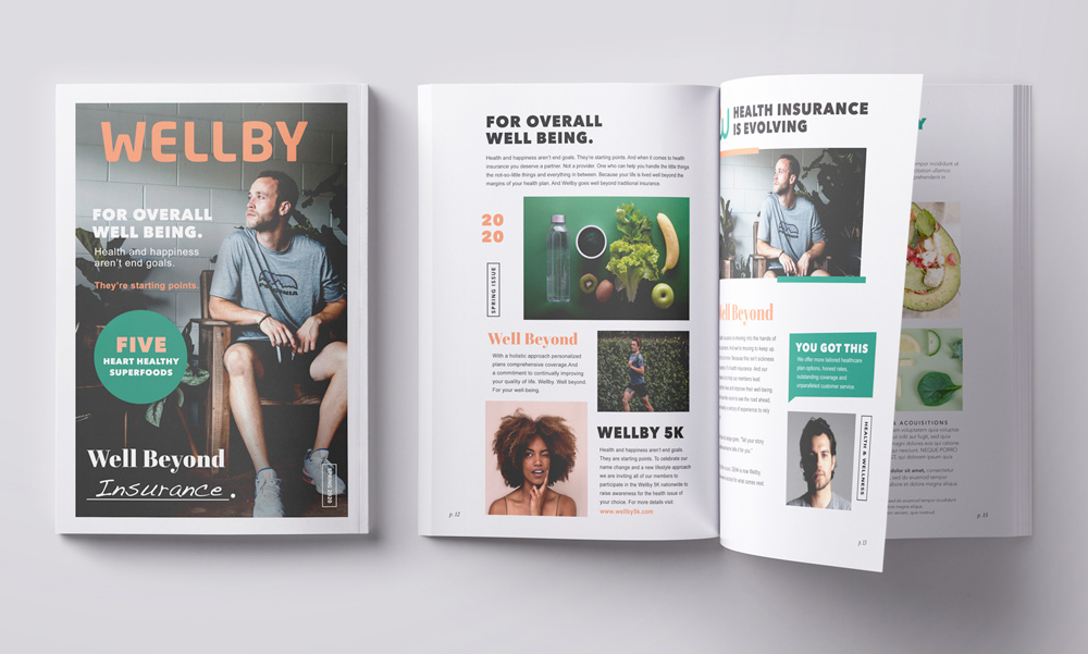
Wellby
Brand Identity & Digital


Wellby was a new kind of insurance company that was positioning themselves as a lifestyle brand. They wanted to show their customers that not only did they have their back when it came to insurance but they also wanted them to live their best life. Mind and body.
Logo & Color
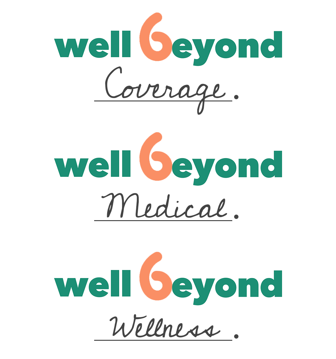
Playing off of the brand name we came up with the perfect brand position tagline..."Well Beyond" Setting up this device allowed us to expand upon the lifestyle aspect of the brand through visuals, photography and apps.
"Wellby goes Well Beyond Healthcare."
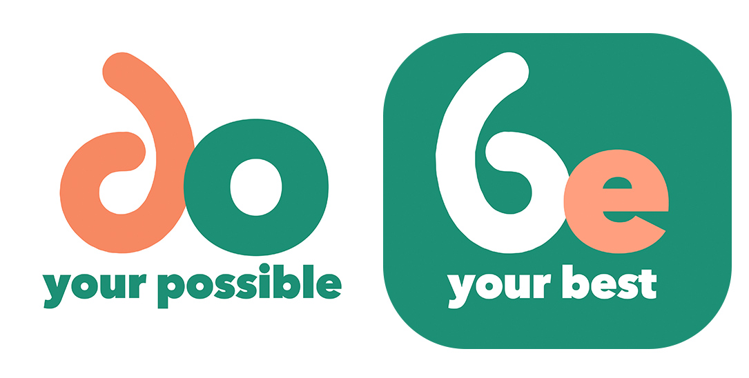
After some logo exploration we landed on the W loop. By creating this mark we were able to pull the loop off of the W and flip it on the side to create a lower case B that could be used in our "well beyond" lockup. It has a slight playful nature to it while still maintaining sophistication.


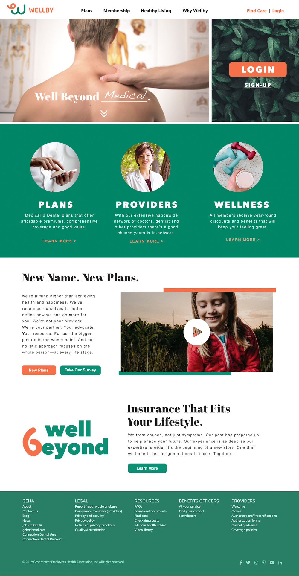
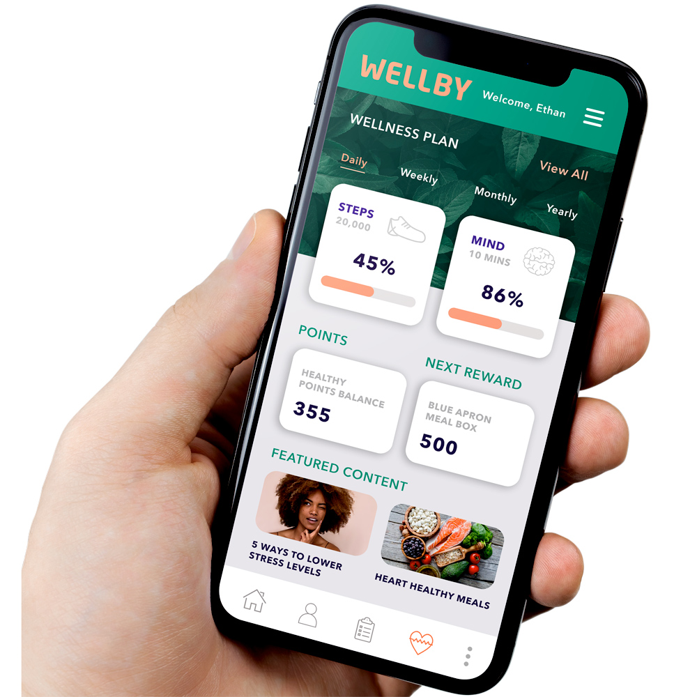
Website & App
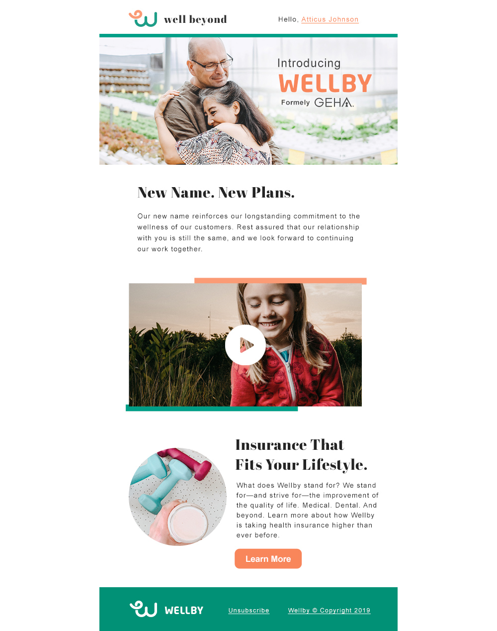
Wellness Magazine
