CONCEPT: Kansas City Royals
TYPE: Web
![]()
When it comes to most sports leagues every team page is built as a template. Which makes sense. You want to keep the same information in a place that multiple users can navigate and find the information they are looking for easily.
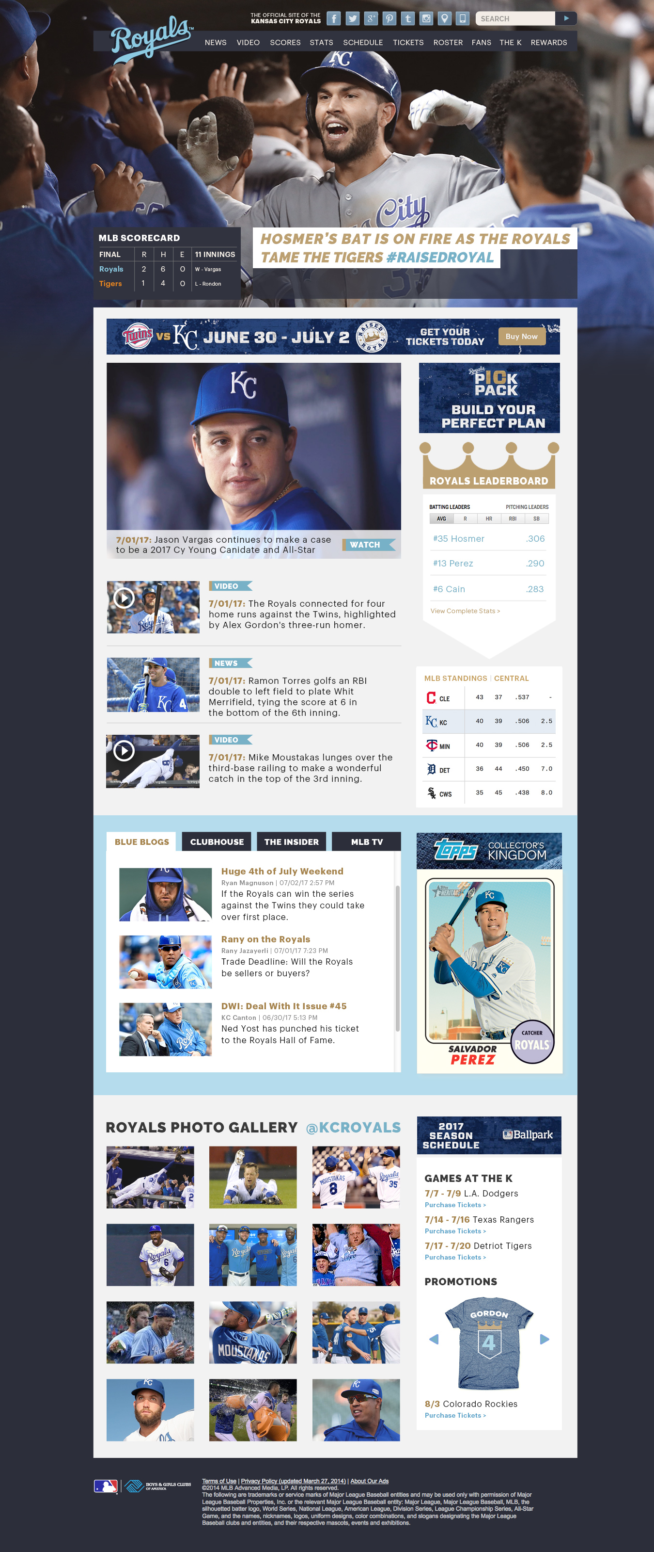
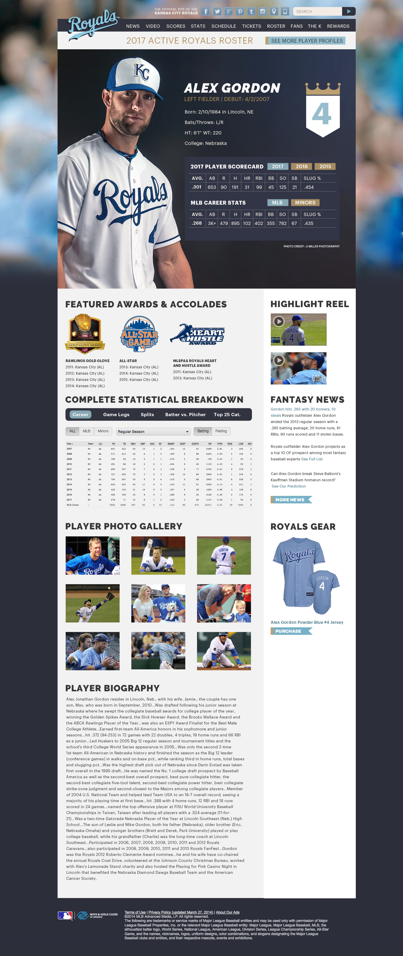
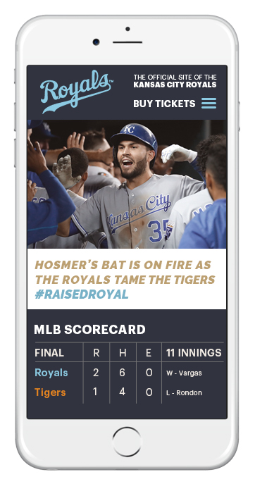
The problem I saw with the MLB template was it was a lot of information thrown about the page. My goal was to simplify the layout and create easier digestible chunks of information on both desktop and small devices to make it much more streamline and easier to navigate. In doing so I also wanted to make sure a distinct look and feel was conveyed in the template to bring the raw emotion of the team to the fans. I achieved this by using action packed shots in the hero space that spans the full widget of the screen. Giving fans a quick hit headline and box score for the latest game.
Below that we have advertising space along with some quick hit headline news and videos with leader boards and standings.
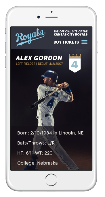
Using large clean and stylized images for player bios also brings in a branded look and feel along with some personality. It achieves this all while keeping things clean and streamline.
KC
Mobile: Home & Newsfeed
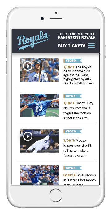
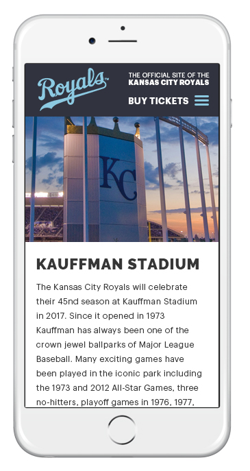
Pulling in a complicated and complex layout from desktop to small screen mobile devices proves to be a chore but not impossible. We can let the hamburger menu do some of the heavy lifting while still creating a clear and concise layout that gives fans a quick hit of the information they are looking for.
KC
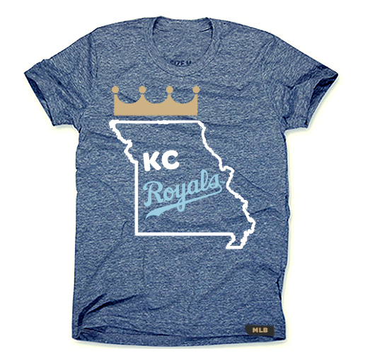
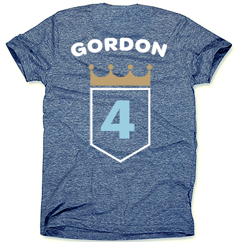
T-Shirt Tuesday: Gordo Nation Crown Town
All to often I see T-Shirt Tuesdays features shirts that are less than desirable. Outside of the Charlie Hustle t-shirts most of them aren’t great. So I wanted to create a shirt that conjured hometown pride with one of our favorite Royals of all-time…Alex Gordon. Keeping the t-shirt design clean and simple matches our approach to the interface design completing a holistic approach and experience.
